Author Archives: dsmithson

Spyder Client Command Key Visualization

My favorite feature in the Spyder Client for Windows 8.1 is the command key thumbnails it displays.  These thumbnails are smart, in that they combine the live look on screen with the expected execution plan for the command key, resulting in a true thumbnail preview of what the screen(s) can be expected to look like after the command key has executed.  In the video below, I give you a quick overview of this feature in action.

First App in the Windows Store (Yes it’s another Spyder Client)

Historically, when I’m taking a new platform or development tool out for a spin, I end up creating a control client for Spyder.  It’s nice to be able to work against a well-known and well-understood platform, so you can focus on the new and exciting stuff.  In this case, which is no exception, I fired up a Windows Store application targeting the Windows 8.1 platform.  In all truth, I think I started this about 5 months ago, however the project didn’t make real traction until the week of Christmas this year (which I took off from work).  I put forth a hard goal of getting the application into the store by the end of that week, in hopes that I wouldn’t aimlessly squander away my week at home.  At the end of the week, a new application had indeed been introduced to the store, and while it’s pretty ‘fresh’ I’m proud of the results so far.

Check out the app’s official page on this site here

Check out the app and download it from the Windows Store here

Feature Set on Day One (What’s there and what isn’t)

Getting something into the store on a compressed timeline is tricky, and there are always a lot of features that get dropped.  I’ve been reading The Lean Startup, and one of the concepts reiterated regularly is the concept of getting something out there early to collect feedback to iterate against.  Waiting too long for something to be perfect (which isn’t a real thing) means that you can spend an inordinate amount of time working on features that people don’t care about.  This is pure waste, and in a project like this where all development is happening in my free time, there simply isn’t time for waste.  All that being said, here are the features as they exist on day one, and my current view of where they could go in the future.

Note that this is my list, and I’m providing it to you in hopes of hearing some of your feedback.  Tell me what is and isn’t important to you, and together we’ll be able to make this app better.

Main Screen


Home Screen

The main screen is the landing page for the application when opened, and displays all servers available on the network, each with a thumbnail sized live view and launch buttons to command keys, function keys, and still image pages.  The functionality is pretty straight forward, so I won’t list out what is there in more detail here, but there are a few things that I would really like to see go into a near future version of the application:

Planned Main Screen / General App Features

  • View of system health / user diagnostics (with launch button to a health screen)
  • Ability to select any of the buttons and open their associated pages in a new window, allowing multiple views to be displayed simultaneously.  This could be a big deal for multi-monitor users, and opens up more complex control and monitoring scenarios for even single monitor users.
  • Sources view / list, showing thumbnails and tally status.  Used in combination with the previous feature bullet, this could allow for drag-drop support onto the live view

Live View

Spyder Client - Live View

This is effectively a display simulator view, designed to give a real-time view of the system’s PixelSpaces and layers using thumbnails pre-configured in Spyder.  Creating a full-featured simulator brings a number of complexities, and this control is very primitive by the standards of the simulator in Vista Advanced.  The live view control will undoubtedly be the benefactor or the majority of near future development work as a result, and to get the most bang for the buck I’ve re-used this same control to provide thumbnail visualizations for command keys and the thumbnail view on the main page.

Live View Features on Day One

  • Preview / Program PixelSpaces
  • Solid Color Borders with bezel luminance offsets
  • Thumbnails for PixelSpaces and Layers
  • Smooth motion views of layers and background transitions

Planned Live View Features

  • Full bitmap borders and shadows
  • PixelSpace Stackups (different view configurations for PixelSpaces)
  • Layer number indicators
  • Interactive control (layer pinch resize, reposition support)
  • Drag/Drop support for sources / stills

Command Keys View

Command Keys

The live thumbnail view within the command keys page is (in my humble opinion) the most interesting feature within the application.  This works extremely well at showing what-if scenarios for recalling relative command keys, but is very limited today by the general render capabilities of the live view control used to generate thumbnails.  I don’t think I can understate this; the renderer is pretty feature light and falls down quickly when showing more than the most basic of looks.  As stated previously though, this will gain all the development benefit of work applied to the live view, and so I think it’s only a matter of time for this to get flushed out.

Command Key Features on Day One

  • Displays user defined register colors for command keys
  • Groups buttons by existing user defined pages
  • Live generated preview of ‘Program’ (Cue 1) look for command key
  • Absolute / Relative Indicator
  • Preview / Program tally indicators

Planned Command Keys Features

  • PixelSpace stackup switching
  • Ability to turn off live view integration with thumbnail previews.  Not sure if anyone would actually want this feature – seems to me like once you have a feature like this you would never want to turn it off (would love your feedback)
  • Option for different button sizes to condense more command keys onto the screen
  • Pinch zoom support to jump between pages quickly
  • 320 pixel wide snap view support
  • Link to a full script grid view showing all command key cues with individual thumbnail previews.  I have a lot of thought into this, and will probably need a blog post all it’s own to describe further.

Stills View

Stills Viewer

The stills view came about early on as a side effect of needing to validate the image file processor / transport software, but was handy enough to keep around.  The Advanced client has the ability to obtain thumbnails from the server in a round about way (once you’ve seen them in the simulator they are cached locally in the ‘C:\Spyder\Images’ folder on your PC).

Stills View Features on Day One

  • View all Still images defined in the Still registers list on the Spyder server in thumbnail form
  • View a full screen view of all images by clicking a thumbnail
  • Ability to save image files locally via the app bar
  • Ability to share one or more selected images using the ‘Share’ charm in windows

Planned Stills View Features

  • Native shape file viewer (custom bitmap border shapes)
  • Native shape file creator, with the ability to simply draw a shape on screen and have it saved onto the Spyder server as a shape file.  This would have the ability to load an image into the background to be used as a stencil, and additionally preview the resulting shape at a number of different source aspect ratios.
  • Different thumbnail sizes to show more thumbnails on the screen at once

Function Keys View

Function Keys

I think the Function Keys view is off to a good start; it works (which helps), and it’s approach of showing a very brief text description of it’s execution action makes it easy to see what the button will do before you actually press it.  An interesting note about function keys:  the Spyder data model actually has support for custom register colors for function keys, but this is not brought forward into the Vista Advanced interface.  The Spyder client has support for displaying custom register colors as it does in the command keys view, and so this will auto-magically start working if this becomes implemented in Advanced in the future.

Function Key View Features on Day One

  • Display of Function key names
  • Display of the type of command key
  • Short text describing the action which will be performed when the key is executed (limited to one line of text, may be clipped depending on things like the number of layers affected)

Planned Function Key View Features

  • A pseudo-tally feature which would evaluate the state of the system and show a red tally indicator if the function key appeared to be in it’s executed state.  An assign source function key, for example, would show a program tally indicator if it’s associated source was already assigned to it’s target layer(s)
  • Relative layer recall support.  Function keys with relative layer/device assignments require the layer/device IDs to be specified at the time of recall, and currently there is no way to provide these when executing a relative function key from the Spyder client.
  • Option for a more compact view of buttons to display more function keys on the screen at once
  • Pinch zoom to quickly navigate between pages

Again, the planned features are on my wish list based on what I think would be great additions.  It’s entirely possible that I’m missing the boat on functionality that I’m just not thinking about, and if you think that’s the case then I’d like to hear from you.  Please leave your comments on this post, and in general let me know what you think of the app.

In a future post I’ll talk about the back-end development, project management, and source control technologies, and possible future directions for the platform.


The Useless Box

You know, I’d argue that a box that makes you smile hardly qualifies as useless.  Nevertheless, today I finished assembly on the self named ‘Useless Box’ by solarbotics.com.  This black acrylic box has a single switch on it’s top, which when flipped, turns on a motor connected to a ‘finger’ which pops up and flips the switch back to the off position.  I’ve found myself flipping it on at my desk almost instinctively throughout the day, and it makes me smile every single time.  It’s just simply great.  Take a look at the video to get a better idea of what we’re talking about here.

 Assembly

Assembling the useless box is not hard, but it is a little time consuming, and does require you to solder a small amount of stuff together.  Honestly I think I spent half as much time peeling the protective brown paper off all the parts as I did doing the rest of the assembly.  Here is how your useless box arrives:

Raw materials for a Useless Box

Raw materials for a Useless Box

The assembly breaks into four or five steps, each taking about an equal amount of time.  The instructions estimated 1.5 hours for the full build, but it took me more like 2.5 hours (yes I’m slow).

Build Steps:

  1. Remove all the damn brown protective paper from the acrylic parts.
  2. Solder together the electronics.
  3. Assemble the main box.
  4. Disassemble and then re-assemble the box after you figure out that the piece holding the motor needs to be mounted as the rest of the box is being put together.
  5. Mount the electronics in the box, adjust for fit, and then test!

The electronics harness would have been much easier if I still had a vice to hold the parts in place while trying to solder, but a little scotch tape did the trick in a pinch.  Below is the finished electronic harness and the box parts all laid out:

Assembled electronics harness and box parts

Assembled electronics harness and box parts

And here is the finished product:

Useless box assembled product

Useless box assembled product

Call to Action: Go Buy One

This thing is fun, and is worth plunking down some cash for.  I’m sure you can get it at a number of places, but mine came from ThinkGeek, which is a site I believe you should be giving your money to anyway.  Below is the link; you’ve seen it in all it’s glory, now take one home for yourself.  It’s great for your desk at work and your home, so maybe get two…

Go buy the Useless Box at ThinkGeek


Making a great desktop PC from your Surface PRO

Microsoft’s Surface PRO is a great tablet / laptop device, but for me a problem has always been transitioning away from my home desktop during travel onto a mobile device.  Compounded with the sheer number of PC/Tablet/Laptop/Ultrabook devices I have going, it’s a recipe for pain.  Well friends, there is good news; I found a  Targus USB 3.0 docking station on Amazon which allows you to connect up to 3 additional monitors to your Surface PRO (or other USB 3.0 capable ultrabook / laptop), and it works great!

Targus USB 3.0 Docking Station (ACP70USZ)
https://www.amazon.com/Targus-Docking-Station-Ultrabooks-ACP70USZ/dp/B005YR1PV2

Surface PRO Desktop

I’ve already torn down my old home PC, and moved to using this as my main home desktop PC.  It’s slick – runs faster than the AMD based desktop it replaced, adds a third touch-enabled screen to my traditional dual-monitor setup (nice development plus), and when it’s time to take it with me I just disconnect power and a single USB cable.

Some Windows 8.1 Specific Nice-ities

Natrually since it’s shiny and says Microsoft, I’m running the preview of Windows 8.1 that came out a week or two ago.  This adds some really nice benefits for this Surface desktop of scenario over previous versions of windows that I thought I’d take a minute to mention.

Note:  If your running Windows 8.1 with the Targus docking station, you’ll need to visit the displaylink.com website to download new drivers for the external displays.  Luckily they had drivers for 8.1 within a week of the preview being announced – kudos to them!

First off, it supports independent scaling ratios for each of the monitors, which is a big deal when you have a high DPI device like the Surface PRO connected with some standard 96 DPI monitors.  With all previous versions of windows, stuff would either look really small on the surface PRO or really big on the other monitors, depending on which scaling option you set for Windows.  This is nice addition to Windows, and it works really well in practice.

Secondly, and in my opinion more importantly, it expands support for more Windows store / metro style  / modern apps running concurrently on your desktop, at user definable sizes.  No more single store app with maybe one more snapped to the left or right of that app.  Now you can have multiple store apps running side by side and resize them as you like, and you can even have store apps on each of the different monitors.  Apps can even open other apps in new ‘windows’ or add additional window instances of their own app (think new windows for tabs in IE).  This is another great addition, and I think that with this the Windows Store style applications will become naturally interwoven in people’s daily desktop usage.

Overall I’m super excited about this setup, and I recommend it to everyone.  Be aware that Windows 8.1 is in preview and does have some quirks, so if your not into the pre-release scene (don’t feel bad just because I think your weird) then wait until the August RTM.

Vista Advanced broken (and fixed) when running high DPI displays

I recently became the proud owner of a Microsoft Surface PRO device, and was shocked to see that our main software application Vista Advanced looked absolutely horrible!  It felt like half of the UI was tiny, and the other half was massive in size.  The Splash screen graphic was even bad, having been drawn in a tiled display.  Take a look at this first-run / out-of-box experience on the surface running the latest release (4.0.1 at the time of this writing):

Splash screen background image wrapping

Splash screen background image wrapping

Oversized controls and UI elements make the app usability pretty rough

Oversized controls and UI elements make the app usability pretty rough

The Problem

The problem, it turns out, has to do with the application’s UI frameworks detecting the selected resize mode for the OS (set to 150% scale by default on high DPI devices like the Surface PRO), and scales up the bitmaps and fonts accordingly.  The really annoying part is that only some of the UI elements are affected by this, and this is due to a combination of different technologies and control libraries being used together to put Advanced together.

The Workaround (read: Hack)

There is a work-around to allow existing versions of Vista Advanced software to look normal on your high DPI device, and the way to do this is to open display resolution in control panel and look for the link that says ‘Make text and other items larger or smaller’.  That link will bring you to the dialog below, and from this dialog set the size of all items to 100% (Smaller).  This affects the entire OS, and has the additional requirement of needing you to log out and back in before the setting will take effect.   This is certainly far from ideal, but in a pinch it’ll at least get you by.

Use display settings to change the default size of items to 100%

Use display settings to change the default size of items to 100%

The Real Fix

Modification to AssemblyInfo.cs to disable DPI awareness

Modification to AssemblyInfo.cs to disable DPI awareness

Luckily there is a simple software fix for this problem that we were able to put in place. Inserting the DisableDpiAwareness attribute at the main application’s assembly level will disable the DPI scaling that happens on these high DPI devices, causing our application to render the same size on all computers.  Setting this attribute immediately brings the application back into it’s normal look and feel:

Normal looking splash screen after setting DisableDpiAwareness

Normal looking splash screen after setting DisableDpiAwareness

Normal Advanced application look after setting DisableDpiAwareness attribute

Normal Advanced application look after setting DisableDpiAwareness attribute

Now with this fix, you can see Advanced looks as one might expect it to look again, and without the user having to make any screen resolution hacks to do it.  You’ll see this fix in the next beta version of software (0.55.8), which will roll into version 4.0.2 for those of you who wait for release builds only.

Simple Spyder Preset Recall App for Windows 7 and 8

Back at NAB this year, Vista used a Microsoft Surface PRO device as a free-standing touch screen running a custom application to recall Spyder command keys.  A number of people asked about obtaining a copy of this interface during the show, citing it’s ease of use and simple functionality as a common use case that can be found across several environments.  I worked on this application in my free time leading up to the show, and as it stands this isn’t something that will be formally productized.  It’s a great application for what it does, and as such, I’m making this application available here for those who want it.

Quick screenshot of the preset recall app in action

Quick screenshot of the preset recall app in action

Now for the quick description:  this is a full-screen desktop application which leverages the Windows 8 Metro design philosophy for a modern look.  The app auto-discovers Spyder servers on the network and allows them to be selected in a drop-down (top-right of the screen).  Upon selecting a server, it’s command key pages and associated command keys are displayed.  The command key buttons are greatly oversized, optimizing them for touch-screen scenarios.  A single press of these buttons will recall the program cue of it’s associated command key, and active command key buttons will be displayed in red (take a look at the screenshot above).

If you have any questions or issues getting running, feel free to post a message on the blog here.  It takes zero configuration to get running (other than getting your client PC on the same subnet as a Spyder), and as of this writing has no known issues.  Give it a spin, enjoy, and let me know what you think!

Download the Spyder Preset Recall Application Now

Note:  This application requires the installation of the Microsoft .Net 4.5 Framework

My first Windows Azure hosted Website. Spoiler alert – your looking at it

I was super excited when I learned that shared website hosting was added to the collection of amazing things Windows Azure can do, and so I rushed out and stood up a couple sandbox websites to get the hang of the creation process.  In short, it’s super easy to do, and at free it’s hard to go wrong.  One of the sites I created used the WordPress template

For a few years now, I’ve hosted a WordPress blog under a GoDaddy web hosting account.  I thought it would be fun to stand up a WordPress site using the gallery option


Bitmap Borders and Shadows: Part 2 of n

In the first part of this series of posts I discussed how to use the bitmap border / shadow feature on Spyder X20 and how it works under the hood.  In this post, I’m going to discuss the process for creating custom shapes and getting them loaded into the X20 video processor.  You might want to create custom shapes for any number of reasons, a common one being for corporate logos.  Below are a few examples of custom shapes I’ve generated for the sales team for various demos over time.

CNN_Logo 
DVD player video cut into CNN logo
Shards 
Another DVD player cut into shards

So How is a Shape Defined?

The bitmap border / shadow engine uses a XAML (eXtensible Markup Language)  parser to convert a vector-based shape definition into the specially formatted raster-based image that is loaded to the video processor hardware.  The shape definition is imported into the system as a .shape file, which contains a single XAML PathGeometry definition. Below is the contents of a shape file defining one of the ‘shard’ shapes above:

<PathGeometry
   xmlns="https://schemas.microsoft.com/winfx/2006/xaml/presentation"
   xmlns:x="https://schemas.microsoft.com/winfx/2006/xaml"
    Figures="M 100,0L 62.75,0L 51.75,24.3333L 
     65.9166,24.3333L 66.25,45.3333L 75.75,30.5L
     5.5833,62.3333L 92.5833,75.5L  100,75.8333L 100,0 Z "/>

The real meat of the shape definition is defined in the Figures section of a PathGeometry object, which is written in a mini path syntax.  In practice you’ll be copying and pasting this data out of a tool like Microsoft Expression Design, but in case your curious there are several pages online that describe the XAML path mini-language (one here) that you can peruse in your free time if your curious to know more about how this syntax works.

Tools of the Trade

There are many tools capable of generating XAML output, but my personal preference is Microsoft’s Expression Design tool.  You can download a 60-day free trial of this tool on Microsoft’s site (here).

You’ll also want to have a basic template file that you can paste your custom shape data into.  You can pull this off my site here.

OK I have the Tools, now what?

The steps involved are easier to show than describe, and so I created a video walkthrough showing the process of creating a custom shape with Expression Design, saving it into a .shape file, and then finally importing that shape into Spyder using Vista Advanced.  The walkthrough moves pretty fast; if you have any questions just leave a comment on this blog post for me and I’ll try my best to help.


Summary

So hopefully this post has helped explain the basics of creating custom shapes for your X20 system.  In the next post I’ll spend some more time building custom shapes and logos in Expression Design, and I’ll cover a few tips and tricks I’ve found to make the process more efficient.

Bitmap Borders and Shadows: Part 1 of n

In this next series of posts, I’m going to discuss the bitmap borders and shadows (BBS) feature that first appeared in Vista Advanced 3.5.0.  If you haven’t played with them yet, you owe it to yourself to do so. 

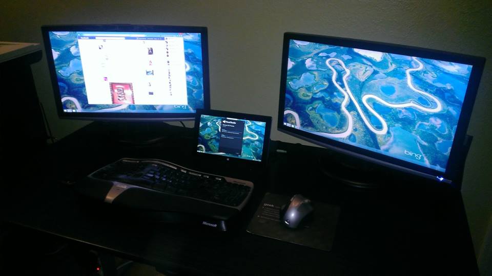
This first blog post will discuss how (and when) you can use the feature, how it works under the covers, and how to get the best possible performance from it.  If you have no idea what the bitmap borders and shadows feature is, take a look at the action shot below.

358

The image above shows two related features, bitmap borders and shadows and window titling.  I’m going to skip over titling for this post, and concentrate only on the bitmap border / shadow feature.

What Can I do With Bitmap Borders?

Bitmap borders goes beyond the traditional supported borders to enable custom shapes and fills to be defined.  Shadows applied will keep the same shape as the bitmap border, and can even have a color other than black defined (not shown).

one layer

Features Shown:

  1. Non-Rectangular window (rounded edges in this example)
  2. Image file used as border texture
  3. Shadow shape that matches the border shape

The Spyder software comes with about a dozen border shapes that you can use, as well as a number of images that can be used to texture the border.  Of course you can create and use custom shapes and fill images, which I’ll be discussing in detail in the next blog post.

The KeyFrame property panel contains handles for all of the available bitmap border and shadow adjustments, and I’ve included a few screenshots of the most interesting ones below.  Using them is pretty self explanatory, and so I won’t bother going through them exhaustively.

border settings border texture border shape
General Settings Border Texture Border Shape


So How Does It Work?

Under the covers, the border / shadow settings selected are used to generate a specially formatted image at a size relative to the input video resolution, which gets loaded once into the target layer where it is in turn merged with the video each frame. The Images below show this process.

Example - Source Video Frame Buffer (2048×1200)

In this frame buffer, the active video is repositioned so that it will fit correctly when merged with the border image loaded.  These offsets are programmed by the server as part of the image loading process

Example - Border Bitmap  Buffer (2048×1200)

This buffer stores the generated image which will be merged with the video.  Special bit values are encoded into the image to specify what area of the image should be mixed with the video and which area should be mixed with the VI.

Example - Both Resulting Image

Once the image is loaded, the hardware in the X20 layer will perform the video cutout and merge the image with the border on a frame-by-frame basis.

Note that the image sequence above makes a point to call out the frame buffer sizes in the layer hardware; a size of 2048×1200.  This is important because the generated image file previously mentioned needs to fit within these dimensions.  Since the image file must be loaded relative to the input video resolution, there may not be enough ‘free’ frame buffer space to generate the desired effect. 

In cases where there isn’t enough space to fit the requested bitmap border / shadow settings, the server will automatically scale back the border offset and then the border thickness until the image fits.

Also note that the image files generated can be relatively large, and in almost all cases you really need to be running a still server to ensure a good experience.  While technically the bitmap borders will work when using traditional USB loading, the image load times detract much of the experience.  There is additional information on the still server on the Vista forum site, and I’ve additionally just completed a post describing the still server here.

Where Bitmap Borders Won’t Work

There are a few scenarios where bitmap border functionality isn’t available, and this section attempts to list them all to save you from surprises in the field.

  • Input Resolutions above 2048 wide OR 1200 high.  This causes the layers to enter a special mode that uses two layer frame buffers, and there is no bitmap border support when in this mode.

  • Running a VI height above 1850.  When your running a VI at a height above 1850, certain layers cannot support still images, effectively disabling bitmap borders.

Tips for Getting the Best Experience

While certainly not required, the recommendations presented here are sure to be extremely beneficial for anyone using the bitmap border / shadow feature set.

Use a Still Server

I know I mentioned this already once in this post, but it can’t possibly be stressed enough.  If your using bitmap borders and shadows (or stills for that matter), then plunk down a few hundred bucks and buy a PC to hook up to your X20 for use as a still server.  The speed performance improvement when using this accessory can easily be over 10x. 

Build Treatments to Recall Bitmap Border Settings

Using treatments is good practice in general, but the load times involved with adjusting bitmap borders and shadows make it an even more beneficial practice.  Instead of manually adjusting KeyFrame parameters each time you want to setup a bitmap border, just make a treatment for the looks you use most frequently (border / shadow treatment settings include bitmap border options).  Not only does this clean up the workflow for the operator, the on-screen experience is nicer since the system will use the smooth go processor to automatically pull the layer off screen while loading the border.

Summary

I always like knowing how things work under the hood, and if your like me then hopefully this has shed a little light on how the bitmap border and shadow feature works.  In the next post, I’m going to discuss how you can create your own custom border shapes and use them with the Spyder X20.

Using a Still Server with Spyder X20

While the still server has been a supported option for Spyder X20 and URS since the initial product release, I’m still surprised to see the number of people who either aren’t aware of it or don’t understand it’s usefulness.  Since it’s usage is essentially a core requirement when using the bitmap border and shadow features I’m planning to blog about shortly, I figured I’d provide a thorough explanation of what it is, how it works, and why you should care.

Traditional Image Loading (No Still Server)

First a little history lesson:  In a traditional scenario where a still server is not in use, images are transferred from the internal X20 computer to the hardware using an internal USB 2.0 hardware link.  This link is fairly slow, and depending on the size of the image being loaded there may be a delay of several seconds to complete a transfer to a hardware input or output frame buffer.  Note that this is the method used on the Spyder 200/300 series systems.  The image below shows a high-level overview of this process. 

image
Figure 1: Image loading without a still server

This approach has a few disadvantages.  As mentioned previously, the image load time can be substantial (over a minute in the case of backgrounds).  Under the covers on the server, there is a substantial amount of CPU and memory being consumed to process and stream the image out to the hardware.  The resulting effect during periods of moderate to heavy still usage can be characterized as a noticeably sluggish ‘feel’ to the system.

Enhanced Image Loading (Enter the Still Server)

When the Spyder X20 was designed, a special DVI-D input connector was added to the output board which is labeled ‘OpMon Input’ (yes the name is incredibly misleading), which allows us to increase still loading speed by relying on an external PC connection.  This external PC, typically referred to as a Still Image Server, runs a special application that connects to the existing Spyder network and listens for requests to display image files. 

image
Figure 2: Still Server Network / Video Wiring Diagram

When configured to use a still server, the Spyder X20 / URS server will offload the image loading instruction to the still server, and then simply instruct the hardware to do a frame capture of the image on the OpMon input and transfer the image into the target input / output frame buffer (see sequence below).

image
Figure 3: Image loading using a still server

This has a number of benefits, the largest of which is the raw speed increase when loading images.  The other big side effect is the reduction in CPU and memory usage on the X20 server, since the ‘heavy lifting’ gets moved off to the still server PC and the X20 hardware.

The description above about how the still server works has been  oversimplified, and there are a number of tricks employed to handle edge cases; scenarios like images with alpha channels being being captured, or where the image is larger than the still server’s output resolution.  Be assured, these are supported scenarios that still reap huge benefits from the still server.

What Scenarios Benefit from a Still Server?

In short, pretty much any operation in an X20 / URS system that loads a still image to a layer or an output will see a large benefit from using the still server.  Below is an exhaustive list, which might contain a few you may not have considered:

  • – Backgrounds (HUGE performance boost)
  • – Stills on layers
  • – Test Patterns (layers / outputs / PixelSpaces)
  • – Bitmap Borders / Shadows
  • – Window Titling
  • – SourceMonitor overlays

Performance Tips

Use a Gigabit network

When using that still server, keep in mind that image files are transferred from the X20 / URS server over the network, and so you can get an additional boost from the still server when your using a Gigabit network for communication.

Use a still server PC with a decent graphics card

While the still server application isn’t a particularly demanding application, it is a graphics application that will take advantage of hardware acceleration where it can.  If your out looking for a new PC to run as your still server, look for something with a decent ATI or NVidia (preferred) graphics card.  If the PC your looking at has one of those Intel Extreme Graphics chipsets, keep looking…

Summary

For many scenarios, the still server is a must-have accessory for the X20 / URS system, and considering the low cost of PC hardware there really isn’t a good reason not to have one.  If your not already using one, do your self a favor and get one.