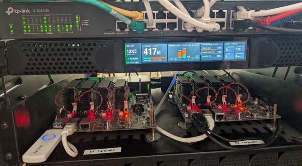
So a couple months back there was an office clean-up at work, and sitting in a pile of stuff on its way to the trash was a long, skinny little USB display mounted in a 1RU chassis as a prototype front panel. Eventually the product went with a much simpler monochrome OLED, probably for very good reasons, but at least this one still worked once plugged into a PC.
In this blog post I’m going to walk through getting that panel lit up in my homelab rack, showing infographic-style status screens for the cluster, the internet connection, Jellyfin, the UPS and a handful of other things, and also how ridiculously fast it came together with Claude doing basically all of the heavy lifting. Like my last salvage project, this one started with a piece of hardware that was supposed to be garbage, and now it’s something I look at every time I walk past the rack.
For those impatient like me, the photo at the top of this post is how it turned out, sitting in the rack between my TP-Link switch and the two Turing Pi boards that make up most of my cluster.
A photo only shows one screen though, so here’s the full rotation captured from the live display:

So What Is This Thing?
The panel is a 1440×240 pixel USB display. That’s a 6:1 aspect ratio, which is about as wide and short as displays get, and since it was already built into a 1RU chassis it dropped right into an open slot in the rack. It shows up on USB as a “UV01DA USB Display” with a DisplayLink chip in it, which sounded like great news at first since DisplayLink has Linux drivers (more on how that went in a minute).
The plan was to plug it into one of the nodes in my Kubernetes cluster and have something in the cluster drive it. My cluster is largely the two Turing Pi 2 boards you can see on the shelf in the photo above (Turing01 on the right, Turing02 on the left), each with four RK1 compute modules under those heatsinks. The Turing Pi’s USB 3 ports are wired to node 4 on the board, so the panel’s USB cable goes into Turing01, which means it physically belongs to a node called turing01-04 and whatever drives it has to run there.
“Look at What I Have in Grafana and Make Me Something Cool”
In one way it’s wild how little prompting is needed to make something cool, and in another way it’s even more wild to consider how much further we can go with stuff like this (and life in general) with such accessible tooling at our disposal. I already had a pretty good monitoring setup going in the cluster, with Prometheus scraping just about everything in the house and Grafana sitting on top of it with dashboards and about 40 alert rules, all managed in Terraform, but I didn’t have any way to see any of it without opening a browser and going looking (or getting a notification in Discord from a triggered alert).
So on a Sunday evening I opened up Claude Code in an empty folder and typed out what was basically “look at what I have in Grafana and make me some cool rack display”. In all truth it was a little longer than that, but not by much. Here’s the distilled down version of that prompt:
I’d like to get a designer sub-agent to consider the dashboards and alerts in Grafana, and design some useful but ‘infographic’ / stylish screens that we can iterate through to give us some info like network/internet bandwidth, key application health and stats like Jellyfin. The kicker here is that the screen display we have is 1440×240 so it’s very wide aspect ratio […] Ideally we can build a framework that will allow us to add configuration as this evolves, sort of like terraform but could probably be a JSON doc.
I also mentioned I was thinking Go and maybe HTMX, and that I hadn’t actually seen a single pixel on the display since I plugged it in (that last bit turned out to be important). Here’s roughly how the timeline played out, straight from the session history:
- 8:30 PM: the prompt above
- 8:50 PM: a test pattern and a moving progress bar on the panel for the first time ever (after a detour through kernel drivers, below)
- 9:15 PM: a sub-agent had read my Grafana dashboards and alert rules and come back with 7 designed screens, rendered to PNG at exactly 1440×240, after three rounds of critiquing and fixing its own renders
- Tuesday 6:30 AM: the whole thing was running in the cluster, deployed by ArgoCD, with live data on the panel and an internal web page at
rackdisplay.int.knightware.net
The designs were good enough on the first try that I mostly just said “these look amazing” and kept going, and I didn’t pick the colors, the fonts or the layouts. Claude even made all the colors ‘565-exact’ (every value lands perfectly in the 16-bit color space the DisplayLink chip actually uses) so there’s no banding on the real panel, which I wouldn’t have thought to ask for. The one real design change I made was pointing out that I already had a speed test service running in the cluster, so we didn’t need to build our own.
Full disclosure here, this wasn’t a magic trick and I did have to do things. I ran commands on the node, I created the GitHub and Docker Hub repos, I applied the Terraform for a Grafana service account, and I told it when something looked wrong. But the ratio of my effort to the result on this one is unlike anything I’ve built before, and honestly it looks better than what I would have come up with on my own.
Getting Pixels on the Screen
Before any of the pretty stuff mattered we had to get the panel to show anything at all. I had already installed DisplayLink’s official Linux driver package (DisplayLinkManager plus the evdi kernel module) on the node, and the display just sat there dark.
It turns out the UV01DA is built on an older DisplayLink DL-1×5 chip, and DisplayLink’s modern driver only supports their newer DL-3xxx and up, so its udev rule never even matched the device and the service never started. The older chips are handled by a driver called udl that’s been in the mainline Linux kernel for years… except the Ubuntu Rockchip kernel on the RK1 is built with CONFIG_DRM_UDL turned off, so it just wasn’t there.
The fix was to build udl out of tree, pulling just the driver’s source files from kernel.org for the exact kernel version the node runs (6.1.75) and compiling them against the installed kernel headers. The first build failed on a missing header file, and once we pulled that down too it built and loaded fine. Then I ran a little Go test program that Claude had written to draw straight to the display through DRM/KMS (the Linux kernel’s display API, so no X or Wayland desktop needed), and up came a test pattern with a moving bar along the bottom, sized perfectly on the first try.
There was one more quirk. udl insists on a minimum framebuffer size of 640×480, and since this panel is only 240 pixels tall a 1440×240 buffer gets rejected. The workaround (read: hack) is to allocate a 1440×480 buffer, show only the top 240 rows, and tell the driver to flush just that region. Later I set the module up with DKMS so it rebuilds itself on kernel updates and loads on boot, and the steps for all of this are in the repo’s panel driver doc for anyone else with one of these panels.
How it Works
With pixels on the screen, the rest is a Go app running as a single pod in the cluster, and the image below is the whole picture:
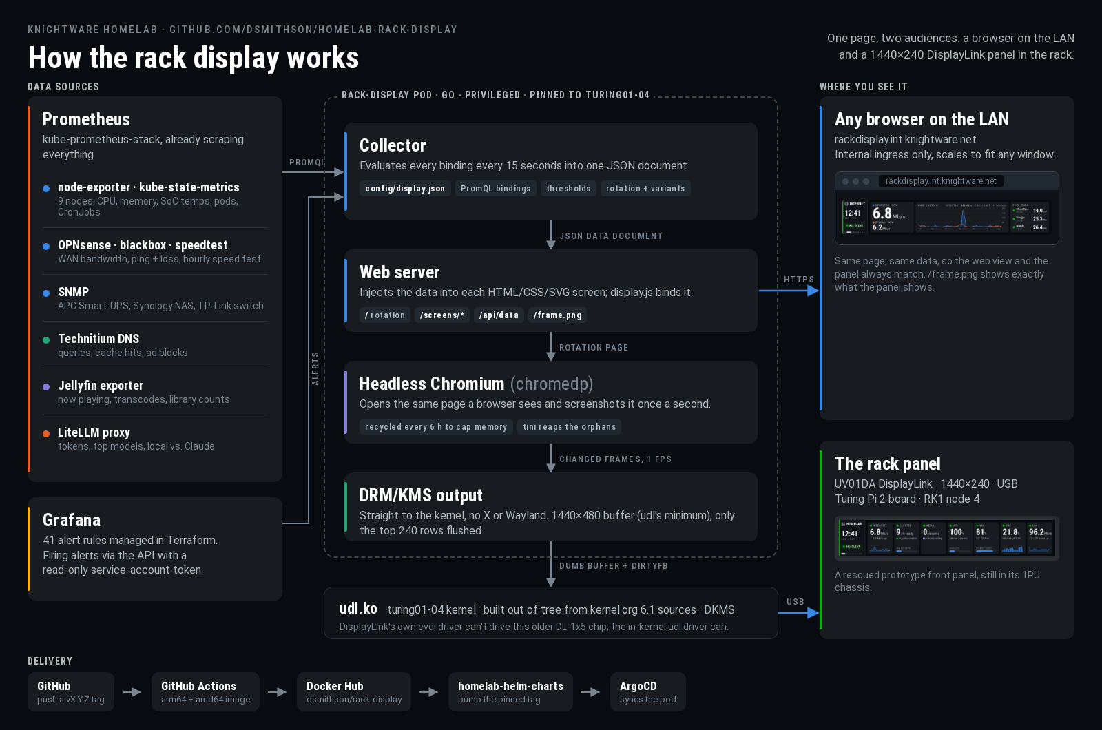
All the data comes out of the Prometheus instance I already had, with node-exporter and kube-state-metrics for the cluster, OPNsense, blackbox and a speed test exporter for the internet connection, SNMP for the APC UPS, Synology NAS and TP-Link switch, plus exporters for Technitium DNS, Jellyfin and my LiteLLM proxy. Alert state comes from the Grafana API using a read-only service account.
Every 15 seconds the app runs every query in a single JSON config file and builds one data document out of the results. This is the ‘sort of like Terraform’ piece I asked for. Each value on a screen is a named binding in config/display.json along with its warning/critical thresholds, and the rotation order lives in there too, so adding a stat is a config change rather than a code change. The screens themselves are just HTML/CSS/SVG pages, and the server injects the latest data document into the page where a small script binds it to the elements on screen.
The panel part is the bit I like the most. Rather than writing a separate renderer, the pod runs a headless Chromium browser pointed at the exact same rotating web page a person would see, takes a screenshot once a second, and pushes any changed frames straight to the panel through DRM/KMS and udl. So the panel and the web view are literally the same page, and they always match.
For Jellyfin, the exporter publishes now-playing sessions, transcodes and library counts to Prometheus, and the media screen just binds to those. The first time I started a movie (Hackers, obviously) and saw it pop up on the display, I may have giggled a little.
Only one process can own the panel at a time, so it’s a single privileged pod pinned to turing01-04 with access to the node’s display devices, and it gets fully stopped before a new one starts during a deploy. If the panel isn’t plugged in, the app just keeps serving the web view and checks back every 30 seconds.
The Chromium thing
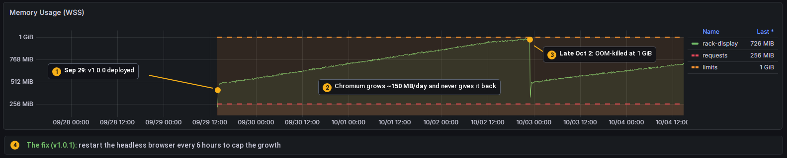
The one real bug so far was memory. Headless Chromium taking a screenshot every second while swapping iframes around grows by roughly 150 MB a day and never gives any of it back, and about three and a half days in it ran the pod into its 1 GiB memory limit and got killed. The ‘fix’ was to restart the browser every 6 hours (with tini in the container to clean up the leftover Chromium processes), which isn’t elegant but keeps the memory in check and works great. Here’s the Grafana graph from before the fix went in:
The Screens
There are currently 9 screens in the rotation (11 counting alternate versions), each with a rail on the left showing the clock, overall alert status and where you are in the rotation. Here they are, captured live:








The LLM screens were added a week later, and adding them was really easy. There’s a little ‘new screen’ skill checked into the repo that walks Claude through finding the metrics, designing the screen, wiring up the bindings and checking it against live Prometheus, so a new screen is now pretty much a one-sentence request.
The Web View (and why it’s not embedded here)
Since the panel is just a browser screenshotting a web page, the same page is available at rackdisplay.int.knightware.net on my home network. It scales to fit whatever window you open it in, there’s a page per screen, and there’s even a /frame.png that shows exactly what the panel is showing at that moment. It’s handy for checking on things from the couch, and I could see it ending up as a widget in a bigger dashboard someday.
I did think about embedding it live right here in this post, but while this blog runs on the same cluster, the rack display is only exposed internally, and I don’t really want my UPS runtime and backup job names on the public internet (or a stranger’s browser hitting my Prometheus every few seconds). So you get the GIF above, which is honestly 95% of the experience.
The Alerts Screen Shamed Me Into Fixing Things
If nothing is firing the alerts screen is pretty boring, which is exactly what you want:

It didn’t start that way. When the display first went live it showed one critical and three warnings, and the critical was a “Monitoring target down” alert for an exporter that had been firing for 21 days. Twenty one days! The alerts had been going to Discord the whole time and I’d just tuned them out. The rotation is also set up so that while anything critical is firing, the alerts screen shows up after every other screen, so half the time I looked at the rack it was flashing red at me. It looked something like this:

Turns out a big red box in the rack is a lot harder for me to ignore than a Discord channel. So I went and fixed (or had Claude and OpenClaw fix) everything that was firing, and it’s stayed green since. I honestly didn’t expect a status display to get me to clean up my alerts, but it did, and that might be the most useful thing about it.
So where are we, and what’s next?
The display has been running in the rack for about a week now and it survives reboots, and releases go out as pinned, tagged versions through ArgoCD, so nothing changes in the cluster unless I bump a version on purpose. It’s also really easy to extend, so I expect the rotation to keep growing. Next on the list is probably per-application health checks for the apps that don’t have their own exporters yet (Immich, the *arr apps, Home Assistant), and maybe that dashboard widget idea for the web view.
If you happen to have one of these DisplayLink bar panels (or any odd-sized display) and want to do something similar, all of the code, screen designs and driver notes are up on GitHub. If you run into any snags or have ideas, the easiest way to reach me is to file an issue on the repo, since I have a bad habit of not checking blog comments for months at a time 🙂
GitHub Project Link: https://github.com/dsmithson/homelab-rack-display
Thanks for reading, and until next time!