Category Archives: Home

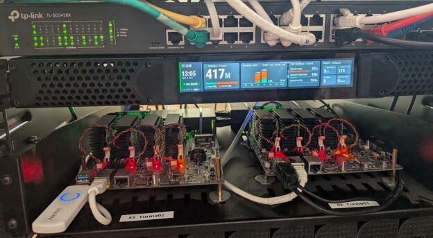
The rack display running in the homelab rack

Homelab Rack Display: Giving a Prototype Panel a Second Life

So a couple months back there was an office clean-up at work, and sitting in a pile of stuff on its way to the trash was a long, skinny little USB display mounted in a 1RU chassis as a prototype front panel. Eventually the product went with a much simpler monochrome OLED, probably for very good reasons, but at least this one still worked once plugged into a PC.

In this blog post I’m going to walk through getting that panel lit up in my homelab rack, showing infographic-style status screens for the cluster, the internet connection, Jellyfin, the UPS and a handful of other things, and also how ridiculously fast it came together with Claude doing basically all of the heavy lifting. Like my last salvage project, this one started with a piece of hardware that was supposed to be garbage, and now it’s something I look at every time I walk past the rack.

For those impatient like me, the photo at the top of this post is how it turned out, sitting in the rack between my TP-Link switch and the two Turing Pi boards that make up most of my cluster.

A photo only shows one screen though, so here’s the full rotation captured from the live display:

Animated rotation of the rack display screens
The full rotation, sped up a bit (each screen normally sits for 8-15 seconds)

So What Is This Thing?

The panel is a 1440×240 pixel USB display. That’s a 6:1 aspect ratio, which is about as wide and short as displays get, and since it was already built into a 1RU chassis it dropped right into an open slot in the rack. It shows up on USB as a “UV01DA USB Display” with a DisplayLink chip in it, which sounded like great news at first since DisplayLink has Linux drivers (more on how that went in a minute).

The plan was to plug it into one of the nodes in my Kubernetes cluster and have something in the cluster drive it. My cluster is largely the two Turing Pi 2 boards you can see on the shelf in the photo above (Turing01 on the right, Turing02 on the left), each with four RK1 compute modules under those heatsinks. The Turing Pi’s USB 3 ports are wired to node 4 on the board, so the panel’s USB cable goes into Turing01, which means it physically belongs to a node called turing01-04 and whatever drives it has to run there.

“Look at What I Have in Grafana and Make Me Something Cool”

In one way it’s wild how little prompting is needed to make something cool, and in another way it’s even more wild to consider how much further we can go with stuff like this (and life in general) with such accessible tooling at our disposal. I already had a pretty good monitoring setup going in the cluster, with Prometheus scraping just about everything in the house and Grafana sitting on top of it with dashboards and about 40 alert rules, all managed in Terraform, but I didn’t have any way to see any of it without opening a browser and going looking (or getting a notification in Discord from a triggered alert).

So on a Sunday evening I opened up Claude Code in an empty folder and typed out what was basically “look at what I have in Grafana and make me some cool rack display”. In all truth it was a little longer than that, but not by much. Here’s the distilled down version of that prompt:

I’d like to get a designer sub-agent to consider the dashboards and alerts in Grafana, and design some useful but ‘infographic’ / stylish screens that we can iterate through to give us some info like network/internet bandwidth, key application health and stats like Jellyfin. The kicker here is that the screen display we have is 1440×240 so it’s very wide aspect ratio […] Ideally we can build a framework that will allow us to add configuration as this evolves, sort of like terraform but could probably be a JSON doc.

I also mentioned I was thinking Go and maybe HTMX, and that I hadn’t actually seen a single pixel on the display since I plugged it in (that last bit turned out to be important). Here’s roughly how the timeline played out, straight from the session history:

  • 8:30 PM: the prompt above
  • 8:50 PM: a test pattern and a moving progress bar on the panel for the first time ever (after a detour through kernel drivers, below)
  • 9:15 PM: a sub-agent had read my Grafana dashboards and alert rules and come back with 7 designed screens, rendered to PNG at exactly 1440×240, after three rounds of critiquing and fixing its own renders
  • Tuesday 6:30 AM: the whole thing was running in the cluster, deployed by ArgoCD, with live data on the panel and an internal web page at rackdisplay.int.knightware.net

The designs were good enough on the first try that I mostly just said “these look amazing” and kept going, and I didn’t pick the colors, the fonts or the layouts. Claude even made all the colors ‘565-exact’ (every value lands perfectly in the 16-bit color space the DisplayLink chip actually uses) so there’s no banding on the real panel, which I wouldn’t have thought to ask for. The one real design change I made was pointing out that I already had a speed test service running in the cluster, so we didn’t need to build our own.

Full disclosure here, this wasn’t a magic trick and I did have to do things. I ran commands on the node, I created the GitHub and Docker Hub repos, I applied the Terraform for a Grafana service account, and I told it when something looked wrong. But the ratio of my effort to the result on this one is unlike anything I’ve built before, and honestly it looks better than what I would have come up with on my own.

Getting Pixels on the Screen

Before any of the pretty stuff mattered we had to get the panel to show anything at all. I had already installed DisplayLink’s official Linux driver package (DisplayLinkManager plus the evdi kernel module) on the node, and the display just sat there dark.

It turns out the UV01DA is built on an older DisplayLink DL-1×5 chip, and DisplayLink’s modern driver only supports their newer DL-3xxx and up, so its udev rule never even matched the device and the service never started. The older chips are handled by a driver called udl that’s been in the mainline Linux kernel for years… except the Ubuntu Rockchip kernel on the RK1 is built with CONFIG_DRM_UDL turned off, so it just wasn’t there.

The fix was to build udl out of tree, pulling just the driver’s source files from kernel.org for the exact kernel version the node runs (6.1.75) and compiling them against the installed kernel headers. The first build failed on a missing header file, and once we pulled that down too it built and loaded fine. Then I ran a little Go test program that Claude had written to draw straight to the display through DRM/KMS (the Linux kernel’s display API, so no X or Wayland desktop needed), and up came a test pattern with a moving bar along the bottom, sized perfectly on the first try.

There was one more quirk. udl insists on a minimum framebuffer size of 640×480, and since this panel is only 240 pixels tall a 1440×240 buffer gets rejected. The workaround (read: hack) is to allocate a 1440×480 buffer, show only the top 240 rows, and tell the driver to flush just that region. Later I set the module up with DKMS so it rebuilds itself on kernel updates and loads on boot, and the steps for all of this are in the repo’s panel driver doc for anyone else with one of these panels.

How it Works

With pixels on the screen, the rest is a Go app running as a single pod in the cluster, and the image below is the whole picture:
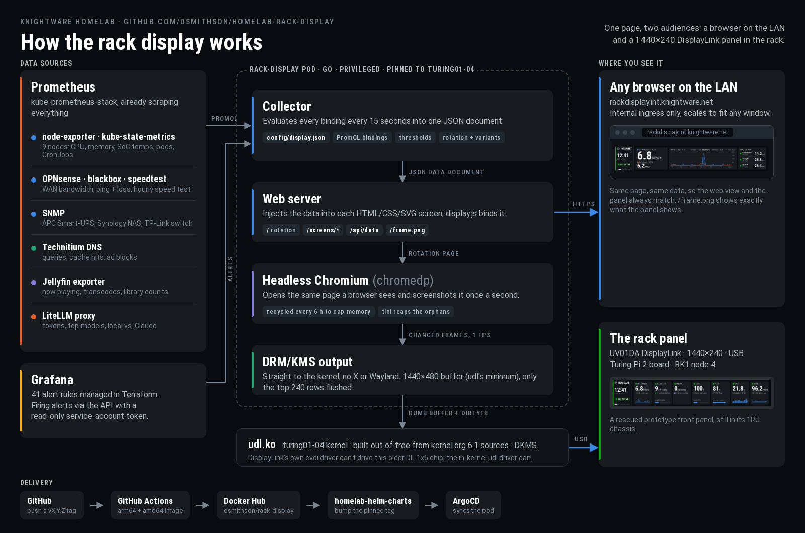
Rack display architecture diagram
How the rack display works, from Prometheus to the panel

All the data comes out of the Prometheus instance I already had, with node-exporter and kube-state-metrics for the cluster, OPNsense, blackbox and a speed test exporter for the internet connection, SNMP for the APC UPS, Synology NAS and TP-Link switch, plus exporters for Technitium DNS, Jellyfin and my LiteLLM proxy. Alert state comes from the Grafana API using a read-only service account.

Every 15 seconds the app runs every query in a single JSON config file and builds one data document out of the results. This is the ‘sort of like Terraform’ piece I asked for. Each value on a screen is a named binding in config/display.json along with its warning/critical thresholds, and the rotation order lives in there too, so adding a stat is a config change rather than a code change. The screens themselves are just HTML/CSS/SVG pages, and the server injects the latest data document into the page where a small script binds it to the elements on screen.

The panel part is the bit I like the most. Rather than writing a separate renderer, the pod runs a headless Chromium browser pointed at the exact same rotating web page a person would see, takes a screenshot once a second, and pushes any changed frames straight to the panel through DRM/KMS and udl. So the panel and the web view are literally the same page, and they always match.

For Jellyfin, the exporter publishes now-playing sessions, transcodes and library counts to Prometheus, and the media screen just binds to those. The first time I started a movie (Hackers, obviously) and saw it pop up on the display, I may have giggled a little.

Only one process can own the panel at a time, so it’s a single privileged pod pinned to turing01-04 with access to the node’s display devices, and it gets fully stopped before a new one starts during a deploy. If the panel isn’t plugged in, the app just keeps serving the web view and checks back every 30 seconds.

The Chromium thing

The one real bug so far was memory. Headless Chromium taking a screenshot every second while swapping iframes around grows by roughly 150 MB a day and never gives any of it back, and about three and a half days in it ran the pod into its 1 GiB memory limit and got killed. The ‘fix’ was to restart the browser every 6 hours (with tini in the container to clean up the leftover Chromium processes), which isn’t elegant but keeps the memory in check and works great. Here’s the Grafana graph from before the fix went in:
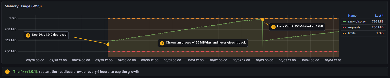
Rack display memory usage climbing to the 1 GiB limit
A nice straight line up to the 1 GiB limit, an OOM kill, and then right back at it

The Screens

There are currently 9 screens in the rotation (11 counting alternate versions), each with a rail on the left showing the clock, overall alert status and where you are in the rotation. Here they are, captured live:


Overview screen
The overview: one tile per area, each with a status dot
Internet screen
Internet: live WAN bandwidth, the last 6 hours, the latest speed test and ping to a few DNS providers
Cluster screen
Cluster: CPU, memory and SoC temperature for all 9 nodes, plus any crash-looping pods
Media screen while streaming
Jellyfin while something’s playing (this one is the design mock with made-up data)
Media screen while idle
When nothing is playing, it swaps to an idle version with library stats
Power and storage screen
Power and storage: UPS runtime and load, NAS volume and disk temps, and the last successful database backups
DNS and network screen
DNS and LAN: Technitium query and block stats, and traffic on the TP-Link switch sitting right above the panel
LLM usage screen
LLM usage through my LiteLLM proxy over the last 7 days, local models vs. Claude (there’s also a 24 hour version)

The LLM screens were added a week later, and adding them was really easy. There’s a little ‘new screen’ skill checked into the repo that walks Claude through finding the metrics, designing the screen, wiring up the bindings and checking it against live Prometheus, so a new screen is now pretty much a one-sentence request.

The Web View (and why it’s not embedded here)

Since the panel is just a browser screenshotting a web page, the same page is available at rackdisplay.int.knightware.net on my home network. It scales to fit whatever window you open it in, there’s a page per screen, and there’s even a /frame.png that shows exactly what the panel is showing at that moment. It’s handy for checking on things from the couch, and I could see it ending up as a widget in a bigger dashboard someday.

I did think about embedding it live right here in this post, but while this blog runs on the same cluster, the rack display is only exposed internally, and I don’t really want my UPS runtime and backup job names on the public internet (or a stranger’s browser hitting my Prometheus every few seconds). So you get the GIF above, which is honestly 95% of the experience.

The Alerts Screen Shamed Me Into Fixing Things

If nothing is firing the alerts screen is pretty boring, which is exactly what you want:

Alerts screen, all clear
All clear, 41 rules watching

It didn’t start that way. When the display first went live it showed one critical and three warnings, and the critical was a “Monitoring target down” alert for an exporter that had been firing for 21 days. Twenty one days! The alerts had been going to Discord the whole time and I’d just tuned them out. The rotation is also set up so that while anything critical is firing, the alerts screen shows up after every other screen, so half the time I looked at the rack it was flashing red at me. It looked something like this:

Alerts screen with alerts firing
What it looks like when things are on fire (design mock, but the real thing looked just as alarming)

Turns out a big red box in the rack is a lot harder for me to ignore than a Discord channel. So I went and fixed (or had Claude and OpenClaw fix) everything that was firing, and it’s stayed green since. I honestly didn’t expect a status display to get me to clean up my alerts, but it did, and that might be the most useful thing about it.

So where are we, and what’s next?

The display has been running in the rack for about a week now and it survives reboots, and releases go out as pinned, tagged versions through ArgoCD, so nothing changes in the cluster unless I bump a version on purpose. It’s also really easy to extend, so I expect the rotation to keep growing. Next on the list is probably per-application health checks for the apps that don’t have their own exporters yet (Immich, the *arr apps, Home Assistant), and maybe that dashboard widget idea for the web view.

If you happen to have one of these DisplayLink bar panels (or any odd-sized display) and want to do something similar, all of the code, screen designs and driver notes are up on GitHub. If you run into any snags or have ideas, the easiest way to reach me is to file an issue on the repo, since I have a bad habit of not checking blog comments for months at a time πŸ™‚

GitHub Project Link: https://github.com/dsmithson/homelab-rack-display

Thanks for reading, and until next time!
The finished panel, showing a green build

Building an Azure DevOps Build Pipeline Monitor from Salvage

How this one got started

Every so often a project starts with a piece of hardware that somebody else has already given up on. This one started in a pile headed for the trash.

During an office clean-out of old stuff, I found and held onto the front panel of an old Phoenix Quad-T, a media encoder that has been end-of-support for a while now. The device was missing its main processing card, but it still had its front-panel in-tact β€” a half-rack wide and one rack unit tall textured plate with curved corners, a little window for a 128×32 OLED, a strip of holes for indicator LEDs, and a frosted hexagon dead center.

For a while it just sat on the bench while I tried to decide what it should be. The OLED and the LED board were still intact, which meant whatever I built could show both text and color. The answer that I kept coming back around to was a build monitor. At work we’ve got a handful of Azure DevOps pipelines that I care about, and “is anything red right now?” is a question I answer by opening a browser tab and looking at a dashboard. A physical thing on a shelf that just tells me seemed like a better answer.

A couple of decisions fell out of that pretty quickly:

  • The center hexagon was too good to waste on a single LED, so I added a 7-pixel NeoPixel Jewel behind it. Seven pixels, seven pipelines. To diffuse it I cut two layers out of a gallon milk jug and stacked them behind the hexagon window β€” I fully intended to replace that with something proper later, and of course I never did, because it works perfectly.
  • It had to be wireless. A device that needs an Ethernet run is a device that lives wherever the Ethernet run is, and I wanted this thing to be able to sit anywhere.
  • I have a bunch of small embedded boards lying around, and landed on using a Raspberry Pi Pico W running MicroPython. It’s cheap, tiny, has WiFi built in, and is quick to iterate on.
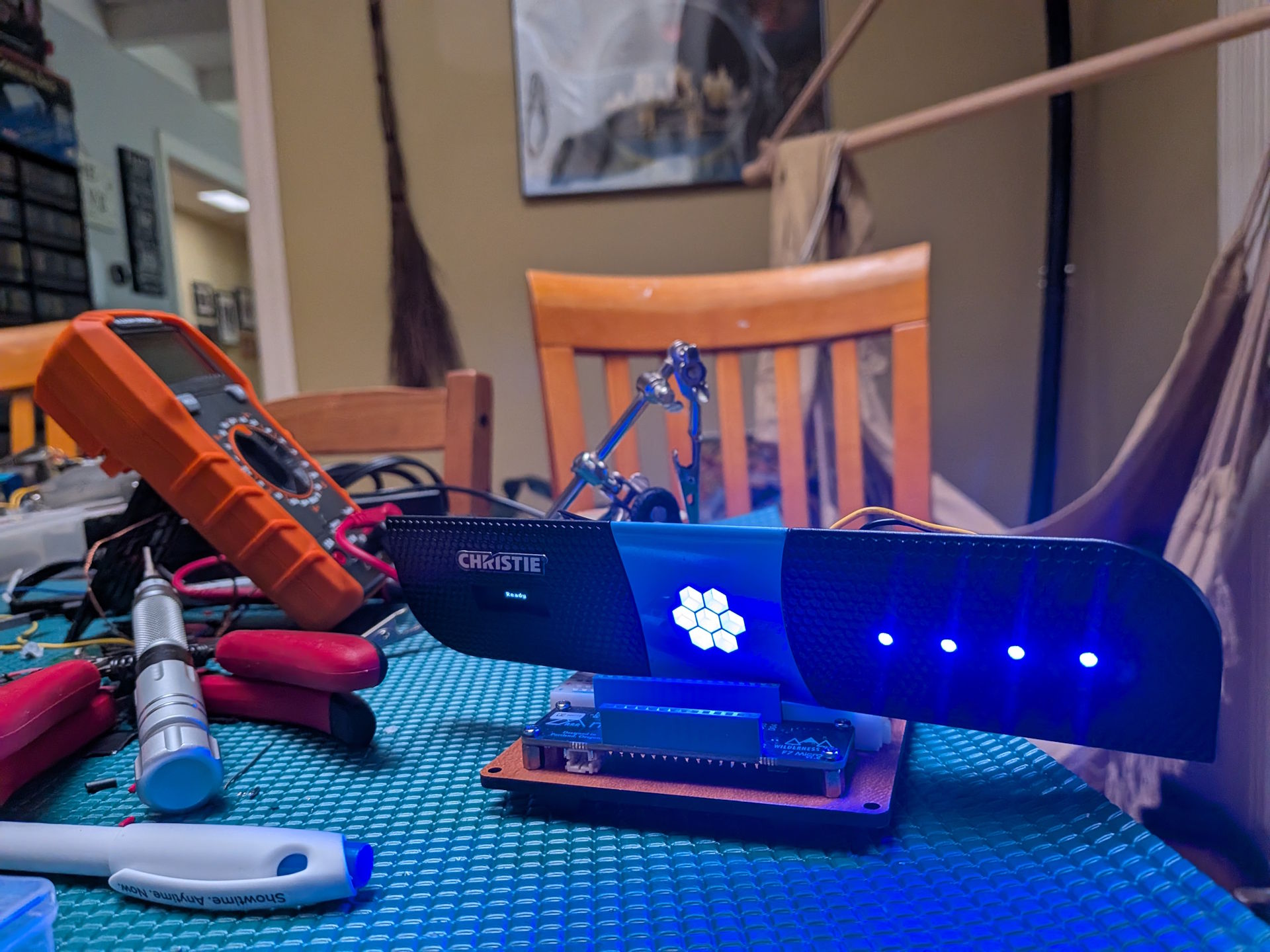
Early bring-up on the bench
Early bring-up on the dining room table

That’s the first time it really looked like something. I had it cycling through some colors for testing ahead of wiring up the real application, but everything worked and looked pretty sweet (albeit crazy bright which I ended up dialing down in software later).

Building the hardware

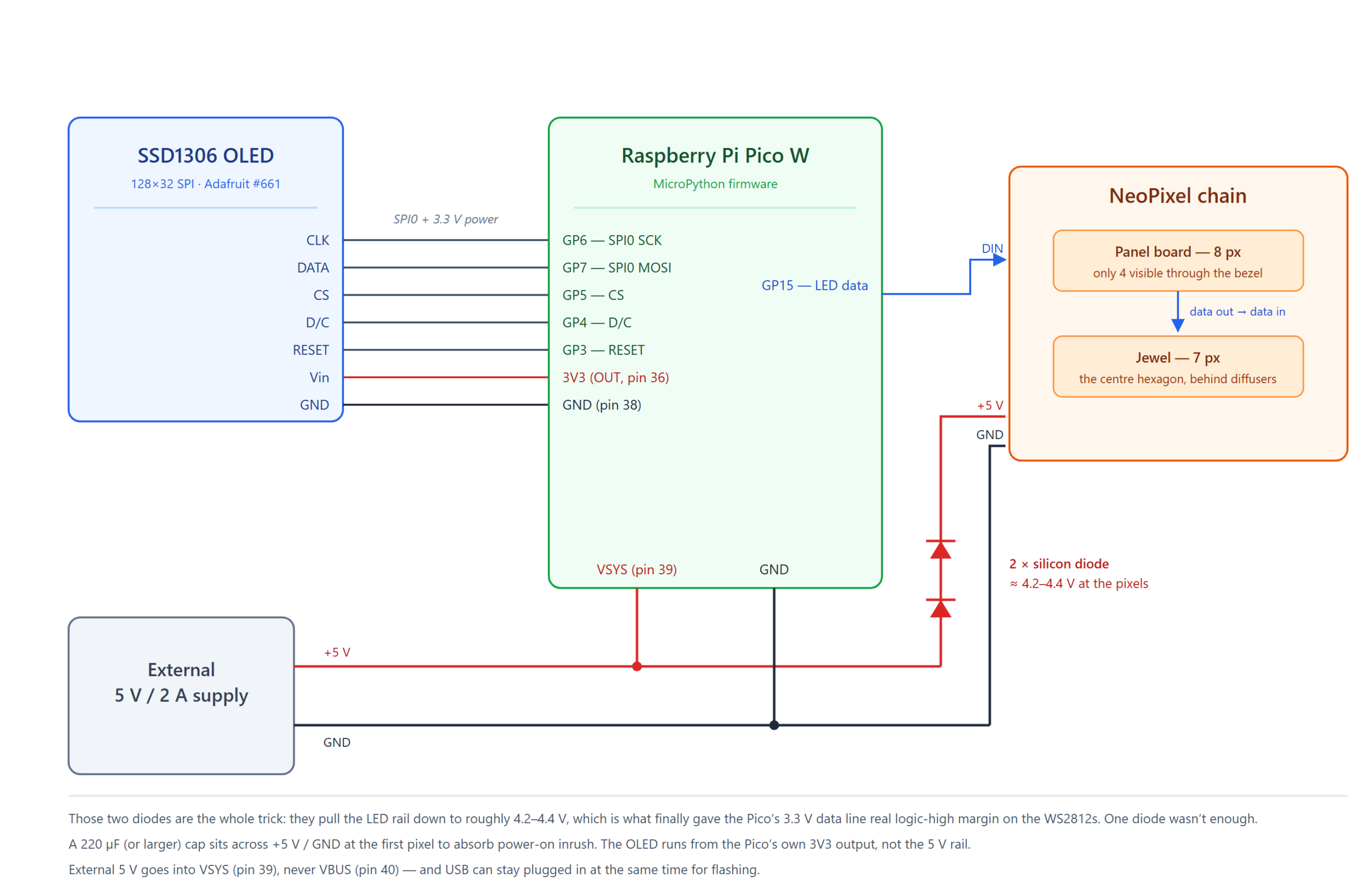
Here’s the whole thing on paper:

Wiring diagram
Wiring diagram

Parts in the panel

  • Raspberry Pi Pico W β€” the brains, and about $6.
  • Adafruit SSD1306 128×32 SPI OLED (#661) β€” this is the stock panel used in the panel’s window. It now runs off the Pico’s 3.3V output.
  • Adafruit NeoPixel Stick β€” 8 WS2812 pixels, though only 4 of them line up with holes in the bezel. The other 4 are wired, powered, and permanently invisible (more on that later).
  • An Adafruit NeoPixel Jewel β€” 7 pixels, and exactly the right size to fill the center hexagon.
  • Two silicon diodes β€” cheap, and the entire reason this works. More below.
  • A 220Β΅F (or larger) electrolytic cap β€” across 5V/GND at the first pixel, to soak up power-on inrush.
  • A 5V / 2A external supply β€” the Pico W pulls 100-150mA with WiFi spikes on top, and 11 NeoPixels at full white can hit ~660mA. 2A leaves comfortable headroom.

The OLED is straightforward SPI β€” clock, data, chip select, D/C, reset, plus 3.3V and ground straight off the Pico. The NeoPixels are a single data line off GPIO15, daisy chained from the panel’s original board into the Jewel.

Power is where it gets slightly more interesting. Rather than run the Pico off USB and the LEDs off a separate supply, I run one 5V supply and “T” it: one leg to the LED chain, one leg to the Pico’s VSYS pin. That’s pin 39, and it’s the input the onboard regulator is designed to accept external power on. Not VBUS (pin 40) β€” that one’s tied to the USB rail, and I learned that feeding it can damage the Pi board. Splitting a single supply this way also hands you a shared ground for free, which the NeoPixels very much require. And because there’s a diode between VBUS and VSYS on the Pico, you can leave USB plugged in at the same time while you’re developing without the two supplies fighting which ended up being massively helpful while tweaking the software on this thing.

The diode trick

Here’s the one that I spent a lot of time on and almost gave up over. WS2812 pixels want a logic-high somewhere north of 0.7 Γ— VDD. The Pico’s GPIO is 3.3V. On a true 5V rail, that’s under spec, and the symptom is maddening: the pixels get data β€” I could see it on my oscilloscope β€” but they mostly ignore it. Sometimes the first pixel lights, usually nothing, and sometimes it worked fine for a few minutes and then stopped.

The fix that finally worked was two silicon diodes in series in the LED’s +5V feed β€” not in the data line β€” dropping the pixel rail to roughly 4.2-4.4V and giving that 3.3V signal actual margin. I tried one diode first, and it almost worked, which is the worst outcome. Forward voltage sags at low current, and this chain spends most of its life dim or idle, so a single ~0.6-0.7V drop kept wandering back out of spec. Two diodes, rock solid ever since. This is apparently common knowledge for smart people, and I saw a lot of posts online about it (after circling in on it by chatting with ChatGPT).

Worth checking your supply too, incidentally β€” some USB bricks like the one I’m using measure 5.4-5.5V under light load, which makes the margin problem worse than the initial math would suggest.

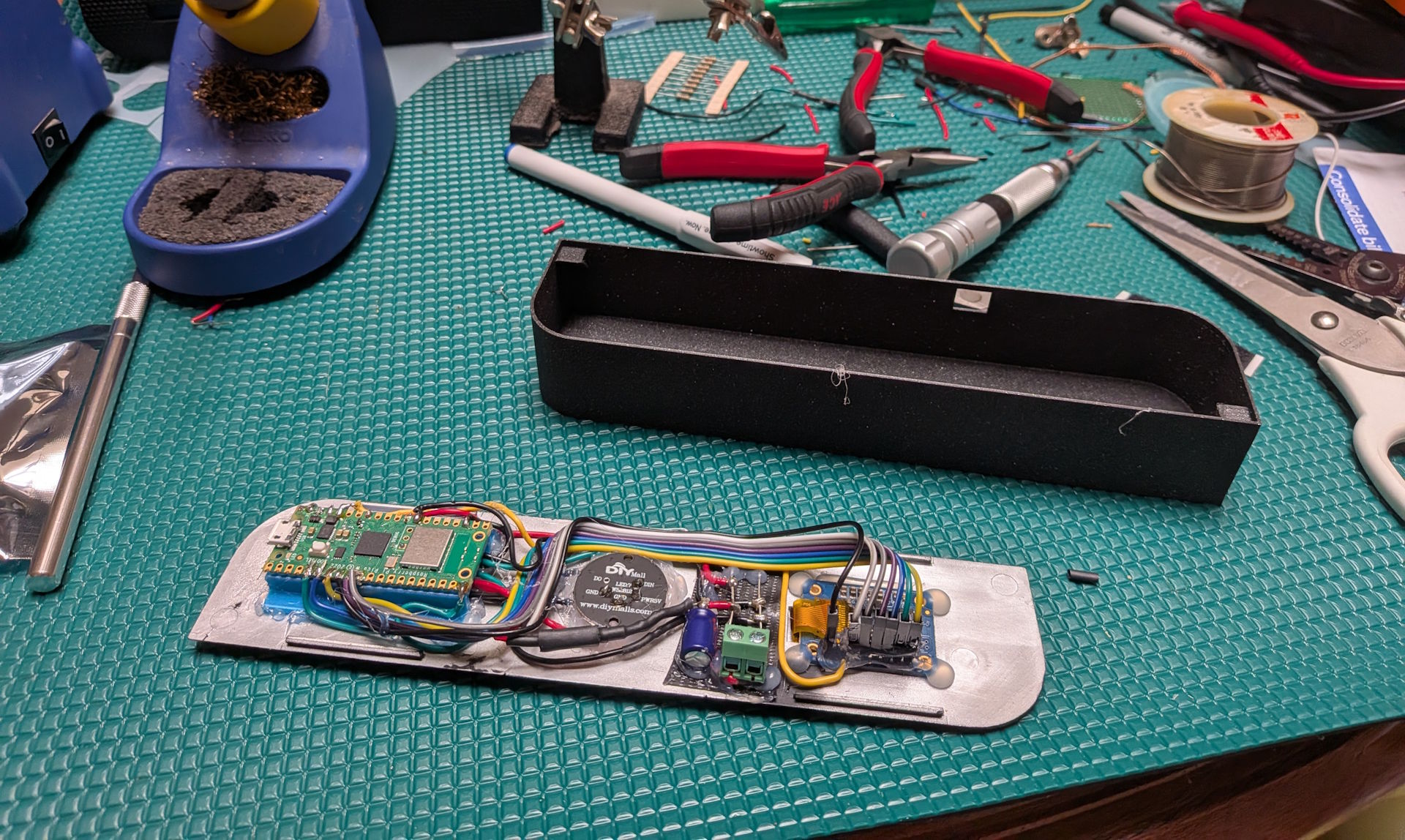
About that soldering

The board on the bench, mid-assembly

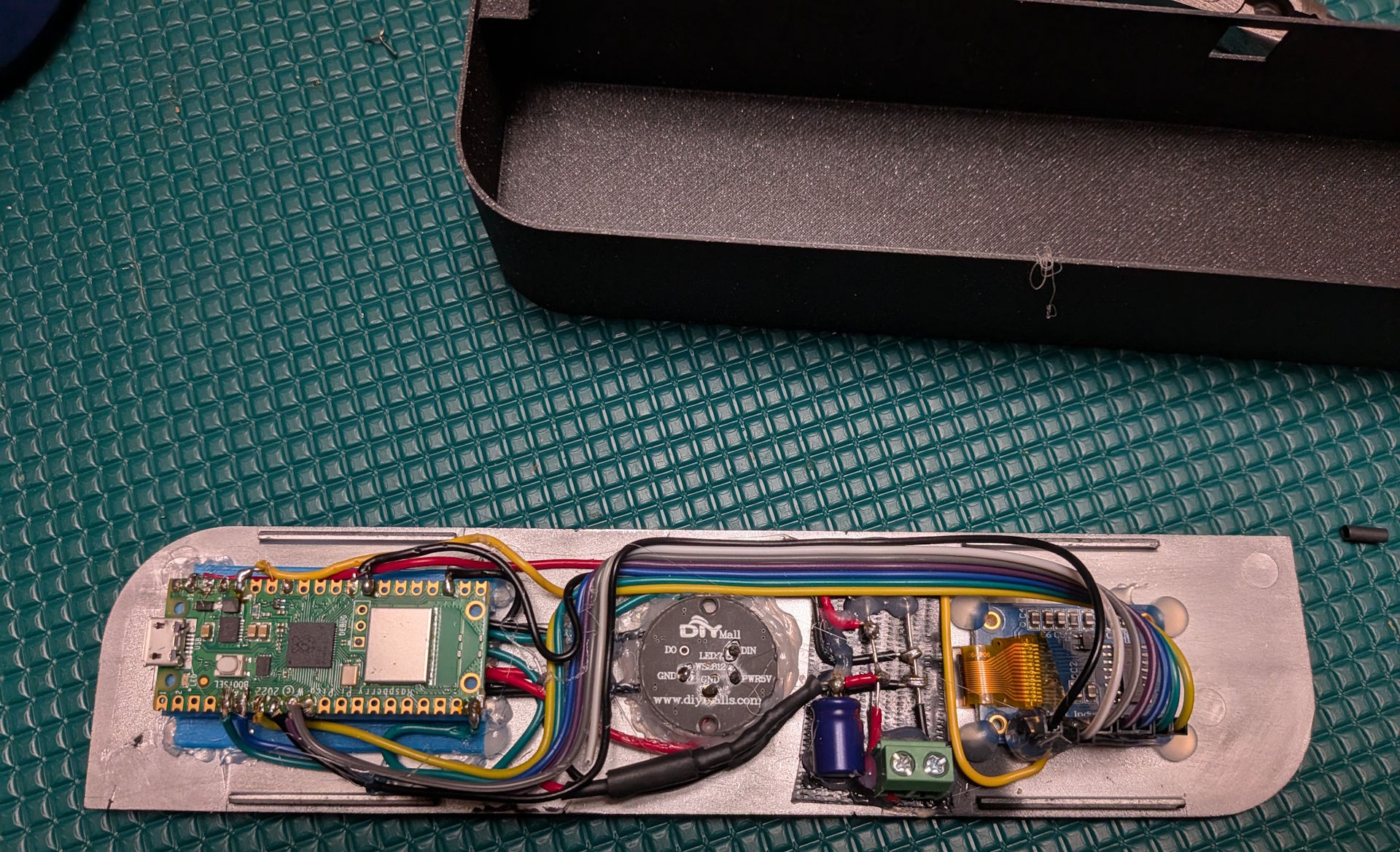
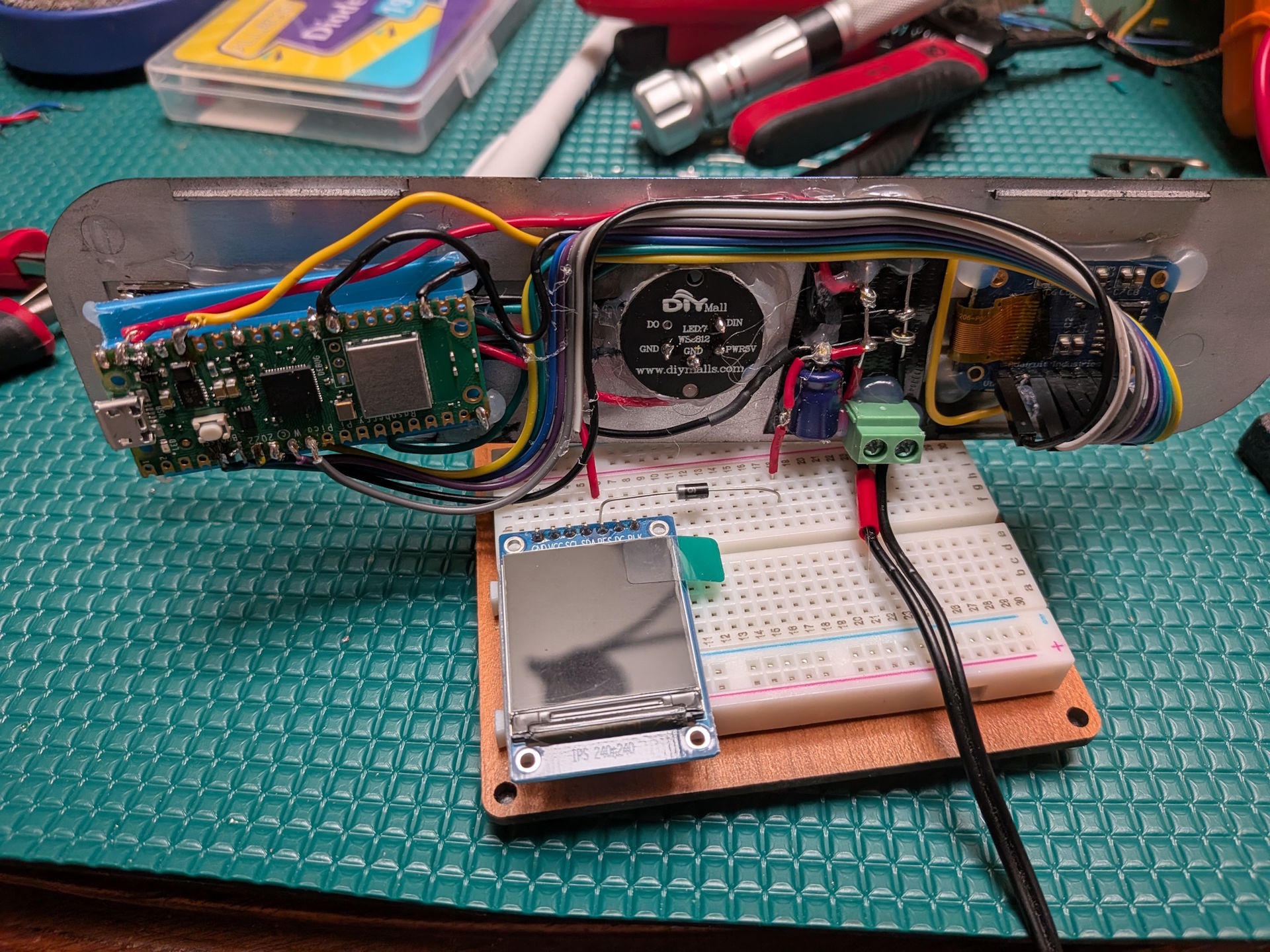
The pictures above and below show the wired-up mess at the back of the panel, and admittedly it’s messy. Every joint on that Pico is a small monument to enthusiasm exceeding technique β€” blobby, over-tinned, and held in position by optimism and hot glue. In my defense: the panel’s backing plate is the mounting surface, everything has to sit flat enough to still fit behind a curved bezel, and there was not a lot of room in there to be elegant.

The back of the assembled panel

It doesn’t look like much, but it hasn’t dropped a connection yet, so I’ve decided it’s a feature.

Breadboard testing with a spare display
Breadboard testing with a spare (unrelated) display

I did most of the ugly experimentation using a breadboard β€” which is where I dialed in that diode business β€” before committing anything to the panel itself. This picture above was the last part where I was figuring out the diode thing.

3D printing a chassis

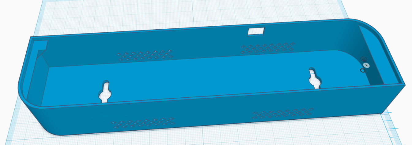
The panel is a curved face with nothing behind it, so it needed a body. I designed one in Tinkercad and printed it on my Prusa Core One, which I will take any excuse to mention because I love that printer. Big enclosed build volume, quiet, and it just prints β€” I’ve stopped thinking about first layers entirely, which is the highest compliment I can pay a 3D printer.

The case design in Tinkercad

The design is deliberately dumb: an open-backed tray that the panel drops onto face-out, with all the electronics hanging down inside it. The panel is held on with velcro rather than screws, which means getting back to the Pico’s USB port is a matter of peeling the face off.

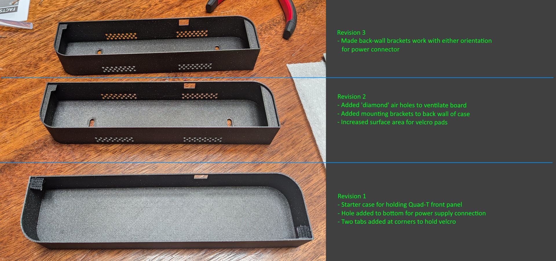
It took three revisions to get right, which I think is about par:

Three printed revisions with notes
  • Revision 1 was the naive version β€” a tray, a hole in the bottom for the power connector, and two corner tabs to hold velcro. It worked, and immediately told me what was wrong with it.
  • Revision 2 added “diamond” vent holes along the walls so the Pico and the LED chain aren’t sealed in a black plastic box (I noticed it getting warm with the first rev), mounting brackets on the back wall so it can hang, and a lot more flat surface area for the velcro to actually grab.
  • Revision 3 was one specific annoyance: the back-wall brackets only worked with the power connector oriented one way. Reworked them so it hangs correctly with the cable exiting either direction.

The STL is in the repo under case-stl/ if you happen to have a Quad-T front panel lying around, which, statistically, you do not.

Building the software

This is the part I actually enjoyed, and the part where the design decisions mattered.

The firmware should be as dumb as possible

The single most important constraint came from the case: updating this thing is a pain. To reflash it I have to peel the panel off the case, find the USB cable, plug into the Pico, push files with mpremote, and put it all back together. That’s a five minute round trip for even a simple change.

In addition to the physical update process, the reality is that this is a simple IoT device that I might repurpose for anything, and instead of writing tedious code specific for one use case on the target, making it a wireless display and allowing external code to control it feels like the more natural fit. In my case I have a homelab Kubernetes cluster providing more than enough infrastructure to provide messaging and application hosting for the Azure build monitor today and whatever else I might want tomorrow.

So the firmware knows nothing about builds, and it doesn’t know what Azure DevOps is. It stores no credentials beyond the WiFi password, makes no outbound calls to anything but the local MQTT broker, and listens on no inbound ports. It is a generic display device: it connects to WiFi, subscribes to one MQTT topic, and renders whatever JSON shows up there. All the interesting logic lives somewhere I can redeploy in thirty seconds.

That MQTT message contract is the whole design, and it looks roughly like this:

{
  "display": {
    "drawMode": "text2Line",
    "textLine1": "EchoCommon",
    "textLine2": "Success: 2 Days ago",
    "textLine1Align": "left",
    "textLine2AutoScroll": true,
    "oledBurnInProtectionMode": "invertDisplay",
    "oledBurnInProtectionInterval": 60
  },
  "leds": [
    { "r": 0, "g": 255, "b": 0 },
    { "r": 255, "g": 0, "b": 0, "displayMode": "blinkThruBlack", "blinkDuration": 0.75 }
  ],
  "transitionDuration": 2.5,
  "transitionType": "smooth",
  "pixelBrightness": 1.0
}

The goal was high-level but rich β€” one message should be able to express an entire visual state, and the device should own everything about how that state gets rendered over time. Some of what it can do:

  • Text, one or two lines, each independently left-aligned or centered, and each able to ping-pong scroll if it’s wider than the screen (with a dwell at each end, because scrolling that instantly reverses looks nervous).
  • Raw pixels β€” you can also just hand it 512 bytes of hex and paint the 128×32 framebuffer yourself.
  • Per-pixel color as a simple array. Position 0 is the first externally visible LED.
  • Transitions β€” immediate, smooth (blend from current to target), or thruBlack (fade down, then up into the new color), with a duration.
  • Per-pixel blinking β€” blink for hard on/off, or blinkThruBlack for a gentle pulse, which is what “this pipeline is running right now” uses.
  • Global brightness, as a single multiplier applied at the moment of writing to hardware.
  • OLED burn-in mitigation, because this display is on 24/7 and may showing nearly the same thing which can get burned into the display permanently. The protocol supports configuration to automatically can invert the panel colors, nudge the text around DVD-logo style, or do nothing.

A few details are worth calling out that evolved organically while I was working on this project. First, the burn-in inversion is motion aware β€” it only flips once the screen has held genuinely static content for a while, and any new content immediately un-inverts. Since the build monitor rotates through builds anyway, this just looked annoying and served no purpose. The one caveat is that if for some reason the application driving display messages stops updating the panel, the panel will protect itself automatically by using the invertion technique. Second call out is for the hidden LEDs: the panel’s board has 8 pixels but only 4 are visible, so the firmware keeps a map from logical position to physical position and never exposes the hidden ones over MQTT at all. Everything upstream sees a clean chain of 11 addressable pixels and has no idea there’s anything else on the wire. Had I thought about this before hot glueing everything together I would have popped the NeoPixel strip out and drilled 4 extra holes, but it’s simply not worth it to me anymore (but since it’s software configurable if I make another one down the road it’s a simple code change to re-enable it).

The device also publishes its last applied state back to a retained state topic, plus an online/offline status topic wired up as an MQTT Last Will β€” so anything that cares can tell at a glance whether the panel is actually alive.

Getting real build data to it

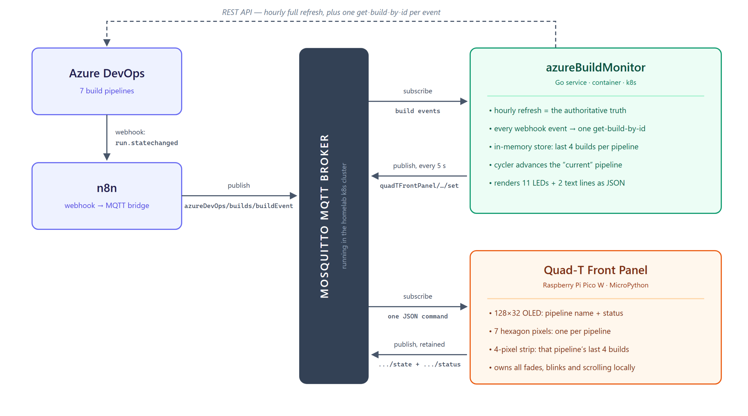
How a build result reaches the panel

With the panel reduced to “renders JSON from a topic”, the rest is a plumbing problem:

  1. Azure DevOps fires a run.statechanged service hook whenever a build changes state.
  2. n8n catches that webhook and republishes it onto my MQTT broker. n8n is already running in my homelab and is very good at exactly this sort of glue, so it saved me from writing and deploying my own webhook receiver just to turn one POST into one MQTT message.
  3. A small Go service (azureBuildMonitor, containerized and running in my k8s cluster) subscribes to that topic, keeps track of the world, and publishes display commands to the panel.

The Go service is where all the real behavior lives, and it works on two timescales at once. It does a full refresh every hour β€” one API call that fetches the latest 4 builds for every pipeline and overwrites its in-memory view with the authoritative answer. That’s the drift-correction backstop. Then, for responsiveness, every webhook event patches that view in place immediately.

The webhook payload alone turned out not to be trustworthy enough to use directly, which was a fun little discovery: it carries no branch name, and its pipelineId field is actually the run ID rather than the build definition ID that everything else is keyed on. So each event triggers exactly one “get build by ID” call to resolve the truth, and that result is what lands in the store. Events make it fast; the hourly sweep makes it correct.

What you actually see

Every 5 seconds the service publishes a fresh command, and that’s what drives the little show:

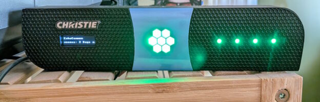
  • The 7 hexagon pixels are the pipelines β€” one each, in a fixed order. Each one always shows its own true status color, so the hexagon as a whole is an at-a-glance health check of everything at once. Green is good, red is failed, blue means running (and pulses through black so it’s obviously live), gray is cancelled.
  • The pipeline being highlighted right now is shown at full brightness while the other six are scaled down to about a quarter. It cycles.
  • The OLED shows the highlighted pipeline’s name on line 1, and cycles line 2 between its status (“Success: 2 Days ago”) and its branch. Once a pipeline has shown all its messages, the highlight moves to the next pipeline and the hexagon follows along.
  • The 4-pixel strip on the right is the highlighted pipeline’s last four builds, newest first. Three green and a red tells you something quite different from four reds, and it’s the fastest possible answer to “is this a blip or a trend?”

Colors and blink timings are all configurable per status, and β€” this detail matters more than it sounds like it should β€” configurable separately for the hexagon and the strip. The hexagon sits behind two layers of milk jug and the strip pixels don’t, so the same RGB triple reads as two completely different colors depending on which group it lands on.

Two bugs that weren’t where I thought they were

The panel would connect to MQTT and then get its socket killed immediately, with the broker logging Bad socket read/write and the client reporting a CONNACK “identifier rejected”. I spent an embarrassing amount of time on client IDs. The actual cause: umqtt’s default keepalive is 0, and this particular mosquitto build accepts the CONNECT and then hangs up. Send a real keepalive and ping on it, and everything’s fine.

Worse β€” and later β€” well-formed clients started getting rejected with strange, inconsistent errors again. This time it genuinely wasn’t my code. My broker’s Kubernetes Service had externalTrafficPolicy: Cluster, which let MetalLB’s L2 speaker answer ARP from a node that wasn’t the one running the mosquitto pod, forcing an extra kube-proxy SNAT hop that corrupted connections from at least one client. One word changed to Local and it’s been quiet ever since. I’d already rewritten a working MQTT library twice by then, chasing a bug that lived three layers below it.

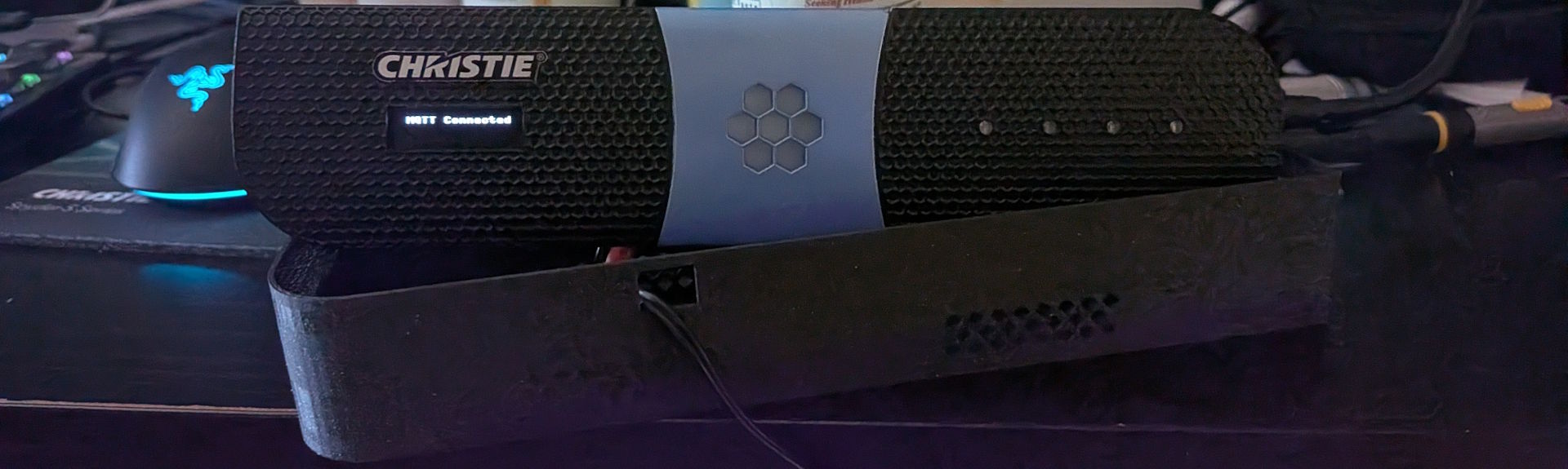
MQTT Connected
MQTT Connected

So where are we, and what’s next?

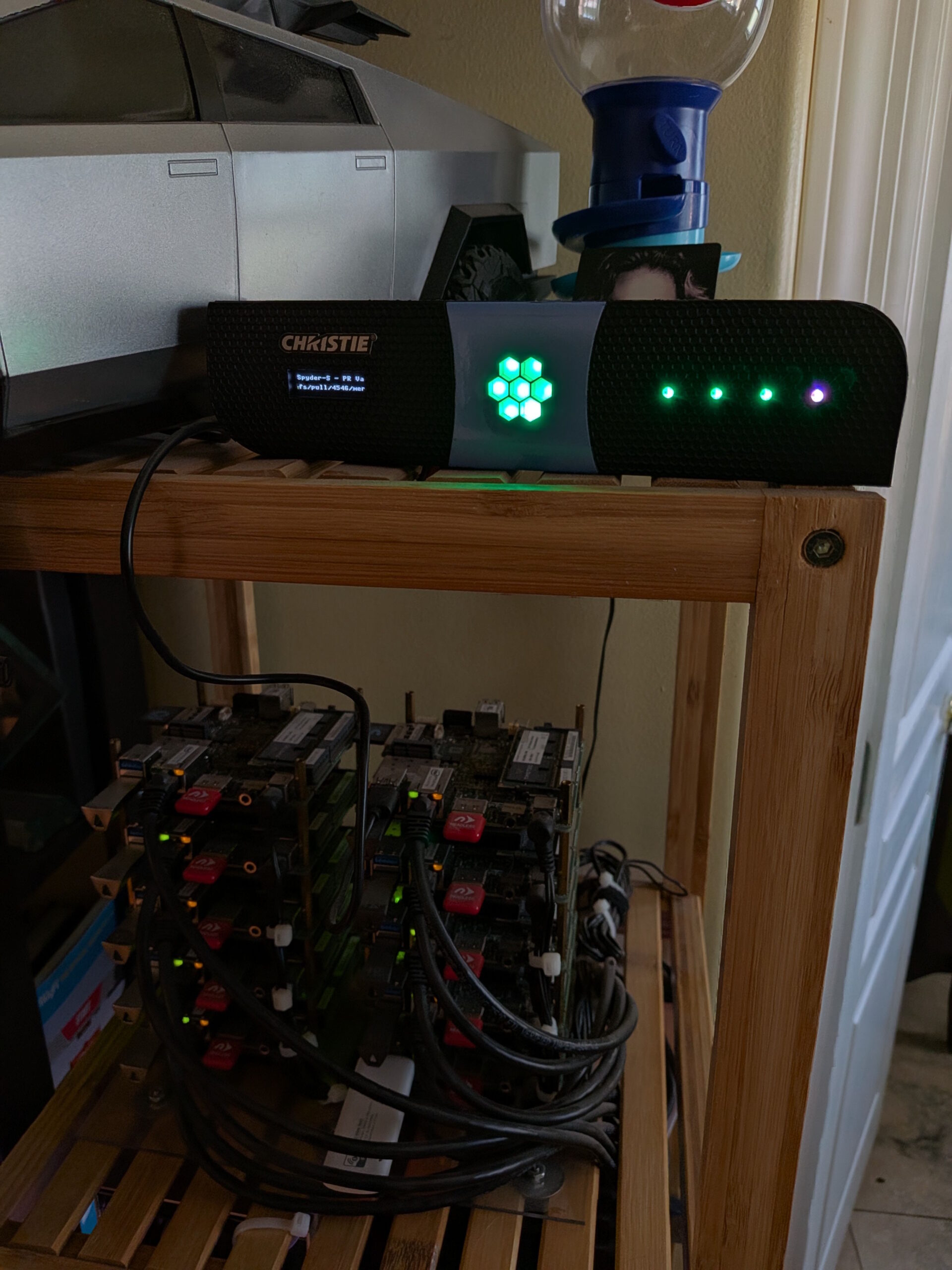
The panel in its natural habitat

This one landed a lot better than I expected. Most of my projects are fun first and useful second, if at all β€” this one is genuinely, boringly useful. It sits on a shelf above my little cluster of boards, and every morning I glance at it on my way past and know instantly whether anything needs my attention. No tab, no dashboard, no login.

The unexpected part is what that’s done to my behavior. When build health is a thing sitting in my peripheral vision, a red pixel is a small irritation that I want to make go away, and I fix things the same day instead of discovering them on Thursday. I did not build this expecting to become a more disciplined engineer, and yet.

Next up, most likely: moving off my local broker onto a cloud-hosted message queue, so the panel doesn’t need to live on the same network as the service driving it. Then I can hang it on my cubicle wall at the office, which was sort of the point all along. Or I’ll just build a second one β€” assuming I can find another junk front panel, which is honestly the hard part.

Everything’s up on GitHub if you want a closer look β€” firmware, the Go service, the tester CLI, and the case STL:

github.com/dsmithson/quad-t-mqtt-display

If you run into problems or have ideas, filing an issue on the repo is by far the best way to reach me β€” I have a bad habit of not checking blog comments for months at a time.